
Image caption
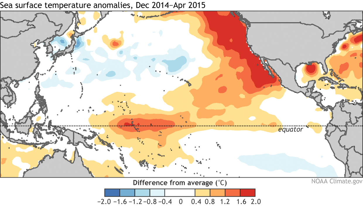
Fig. 4: Sea surface temperature anomalies during December-February, 2015. Red shading indicates above-average sea surface temperature and blue shading reflects below-average sea surface temperature. Data is from NOAA ESRL PSD’s Plotting and Analysis Page and is based on NOAA Optimal Interpolated SST (OISST). Figure created by Dan Vimont and modified by Climate.gov.