
Image caption
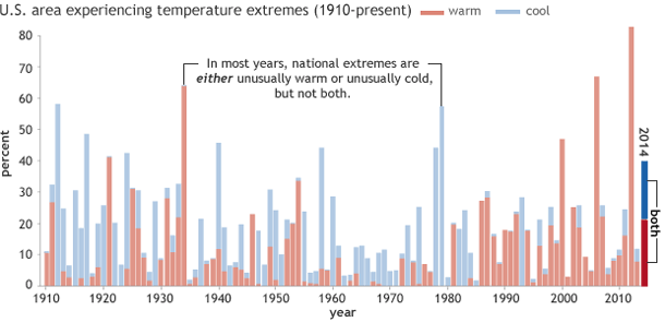
Graph of percent U.S. area affected by extremes in maximum temperature (red is warm, blue is cool) in January-July 2014, based on data from the U.S. Climate Extremes Index (Step 1) from the National Climatic Data Center.
Graph of percent U.S. area affected by extremes in maximum temperature (red is warm, blue is cool) in January-July 2014, based on data from the U.S. Climate Extremes Index (Step 1) from the National Climatic Data Center.