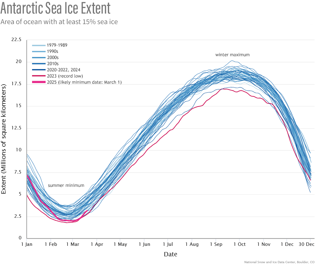
Image caption
Each line on this graph shows the daily sea ice extent around Antarctica for each year since 1979. Extent means “the total ocean area that is at least 15% ice covered” based on satellite data. Years are color-coded by decade: earlier years are lighter blue, and more recent years are darker blue. Unlike the graph for the Arctic over the same period, this graph does not show a clear downward trend over time. The line for 2025 to date, which reaches a near-record low, is bright pink. The line for 2023 (the record-low extent) is a darker shade of pink. NOAA Climate.gov graph, based on data from National Snow and Ice Data Center.