Image caption
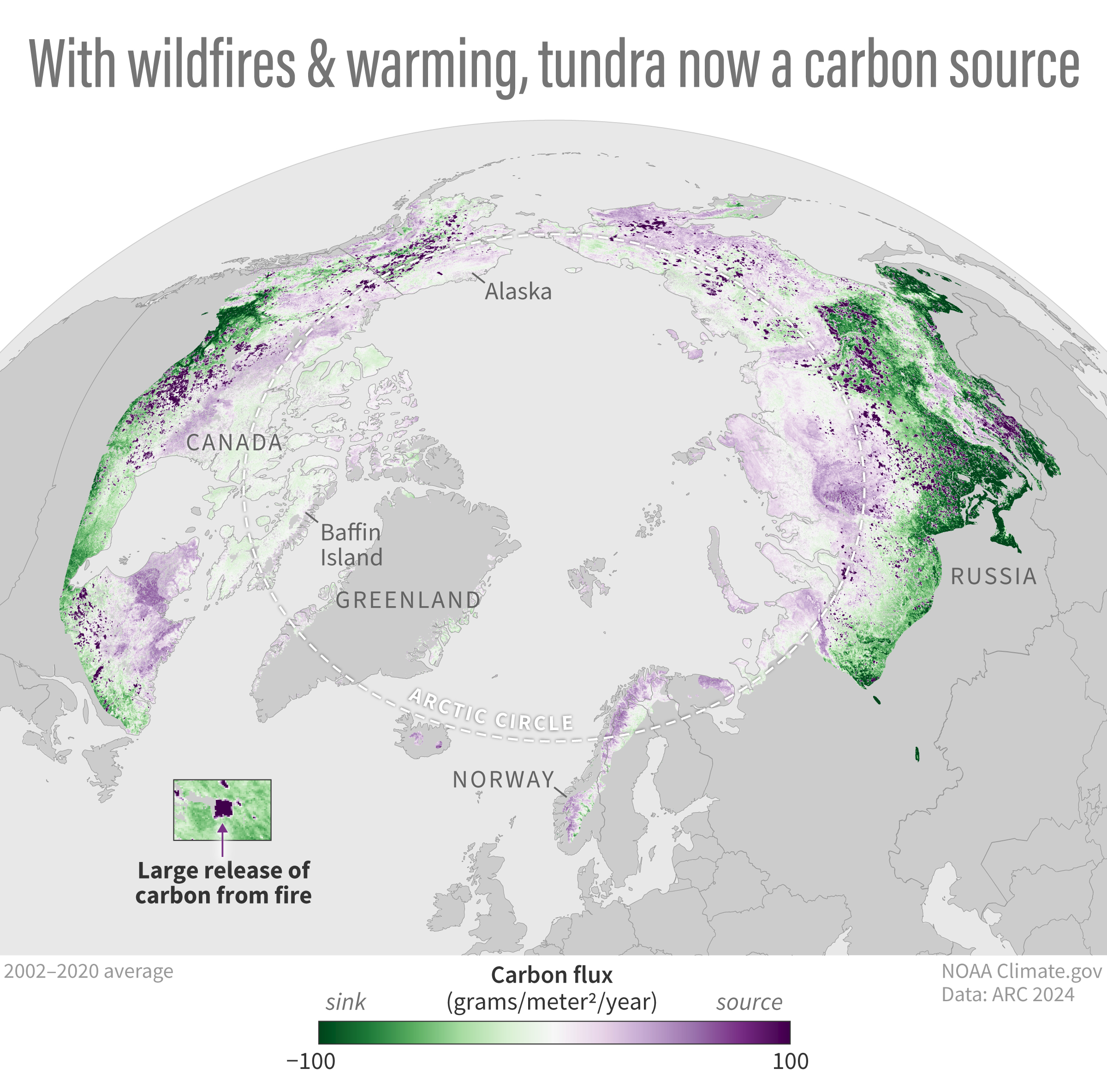
This map shows the Arctic's average carbon balance from 2002-2020. Land areas colored purple were a source of carbon dioxide to the atmosphere. The darkest purple clusters show areas where there were large releases due to wildfires. Green areas had a negative carbon dioxide flux, meaning they were a “sink” that removed and stored atmospheric carbon dioxide. NOAA Climate.gov image based on the 2024 Arctic Report Card - Carbon Cycling. Large image & full story